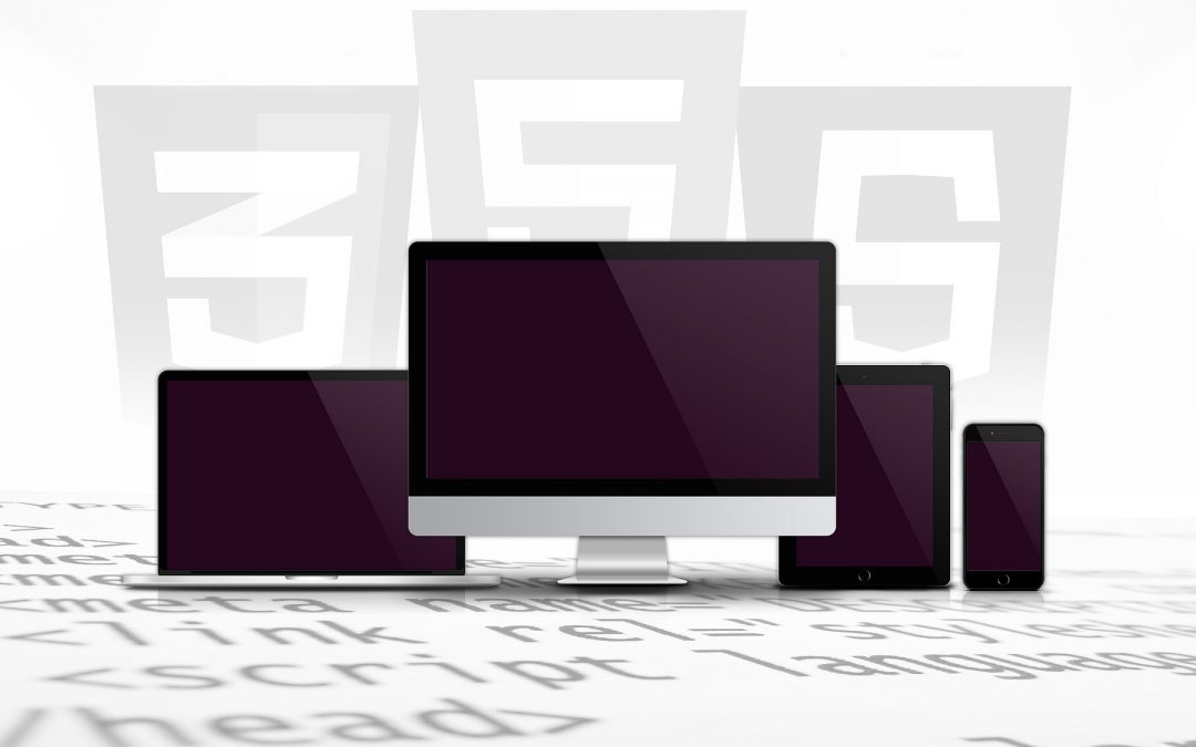
Responsive Web Design, also commonly referred as RWD, is something that is fairly new in web design domain. Basically, it’s a design approach that allows for optimum viewing. So, no matter if you are using a 52 inch monitor or if you are using a 2 inch phone screen, you will be able to see and scroll across the whole of the website without any hindrance. There are many companies that are now focusing to ensure that their websites are designed this way, so that anyone can see and use them on any viewing device that is being used.
What Responsive Web Design is all about, is really a very simple concept that has to do with the extension of the media rule and the adaptability of the viewing environment, so that you have a fluid proportion and flexible images along with the flexible grids. More people are now using smaller viewing devices including their tablets and smart phones instead of a desktop computer, which has raised some very interesting problems for web designers and developers. Some recent statistics point to the fact that over 20% of total web browsing now comes from either a phone or a tablet instead of the traditional computer systems and laptops.
Responsive Web Design has its own set of advantages and disadvantages. Some of the plus sides of using this type of design are that you have very low maintenance. You will only need to maintain one single website. Though the layout and content remains the same across different devices, you can update or fix bugs for all the devices at once on the one single website. You won’t actually have to worry about having to prioritize or have different versions of the site you are working on separately; instead, you will just work on the single website and it will fix the discrepancies across the board.
Another beneficial aspect of the Responsive Web Design is that it’s really user friendly. You will have visitors to the site who feel convenient relating to your brand if they recognize the website on their mobile phones. They will also know how to better use it. When someone has constant style and content, that means they can trust what is going on and won’t see something totally different per the device that they are using. That’s really important to people to have a constant set of things that all look the same.
The downside of the Responsive Web Design can be how much time it takes to develop. When you are doing a basic website, you will actually be doing far less work, because the preparation time is less, the resources are less, and the testing that is required is also much less. So, you will actually have to spend a lot more time to get everything together the way that it needs to be with this type of design.
Also, with Responsive Web Design, even if you are maintaining one website for all platforms, you have to remember exactly what the website is being used for and what kind of people are using the website. If someone is at home on their personal computer, they usually have more time to spend. If someone is on their mobile phone they are usually checking something in a hurry, or want a very specific question answered right away, they expect and demand different and more supportive platform. So, that has to be thought about when you are designing the platforms for different viewing devices.
Another issue with the Responsive Web Design is that the scalable images that are put onto a website can actually lose their detail properties. The scaling is done on the size of the screen being used instead of content, which can make them look fuzzy, out of focus and just pixelated. A good fix for this type of problem is to avoid scaling altogether and simply crop the pictures as closely as you can, so that they do not lose their meaning. Most websites want their pictures and images to stretch across the screen of whatever device they are being viewed on, but this design flaw is really correctable if you go back picture by picture and crop each one correctly to fix it.
To conclude, Responsive Web Design or RWD being a considerably new facet of web designing needs some time to play along well to be able to cater the needs and requirements of majority of the viewers, but it will definitely add to the evolution of web industry.