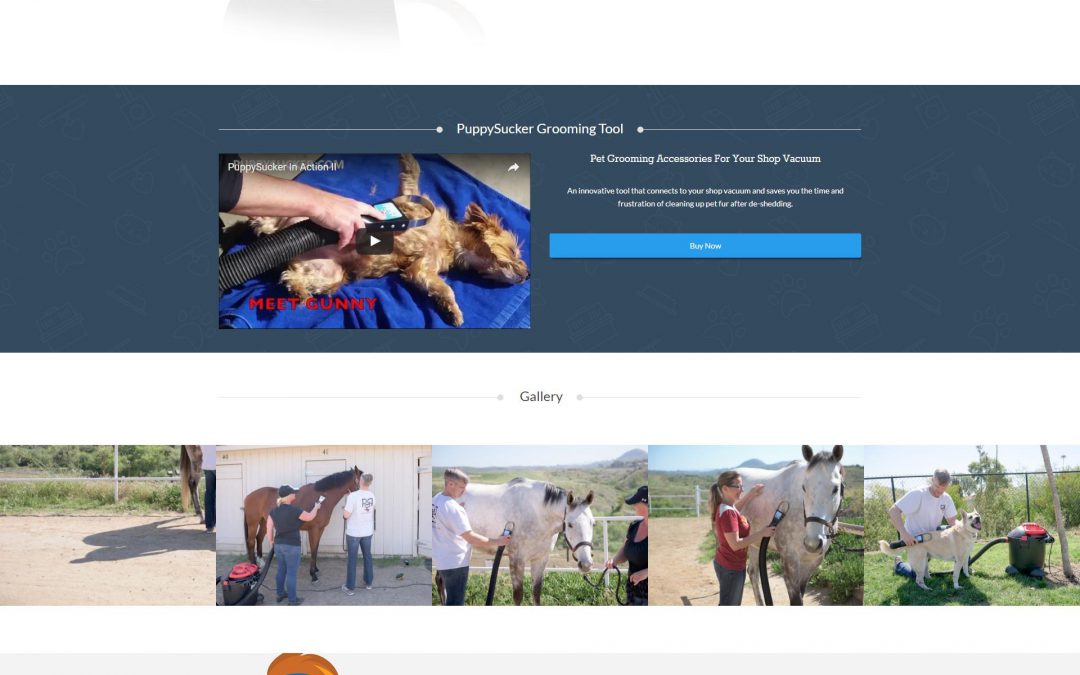
Landing page woes? A landing page is one of the most effective tools for conversion, and a poorly performing landing page wastes the culmination of a process of inbound marketing that can span several channels of advertisement.
Here are seven of the most important parts of your landing page and best practices associated with them.
The Headline
As the first element of the landing page that your audiences’ eyes will gravitate towards, your headline should be succinct and memorable. It needs to clearly state what your audiences will be purchasing or subscribing to via that landing page. It will also help to start hard selling already, so add the main benefit you want your audiences to hear: tell them how this product or service or subscription addresses their concerns.
The Content
While it isn’t recommended that your landing page copy be lengthy, you also shouldn’t sacrifice your marketing message for the sake of cutting your content short. Take as many words as needed to deliver your marketing message and call your audiences to action — no more, no less. The style of the content depends on what you’re promoting via the landing page and who your audiences are. For instance, a B2B landing page would probably use a professional tone, while a landing page that subscribes to a comedy website would try for a playful, informal approach.
Sell the benefits of your product or service and its features, not the features themselves. Focus on the value — consistently show how these features can bring more value for your potential customers.
The Images (and Other Visual Elements)
Images and other visuals help guide the eyes of your audiences, and it also provides a massive amount of data in a shorter span of time compared to words. Use relevant images that reinforce your marketing messages, but don’t stuff your landing page with image after image. A single relevant, powerful image will suffice. Adding too many will distract your audiences from following your layout straight to that purchase button or sign up form.
The Links
Your landing page is not just another typical webpage in your site. It doesn’t need navigation and other links that lead people away from it. You want them to stay on that page and purchase or subscribe. Except from a link to your privacy policy or terms of use or any other important and legal matters, don’t add extraneous links to your landing page.
The Form
Landing pages often integrate a form to fill out to capture as much lead data as possible. Remember these important points when designing forms:
- Place the form above the fold if possible
- Keep it short (preferably, people shouldn’t need to scroll down to finish it) but don’t leave out any essential details that need to be asked
- Use free text fields instead of drop down menus, or add an “Other” option in your drop down menus and offer a text field for it
- Provide important assurances within the forms (legal notices like EULAs and privacy policies)
- Be specific and don’t offer a generic “Contact Us” form, otherwise you’ll received equally generic responses
The Call to Action Elements
You need calls to action within your marketing copy, but since you wouldn’t want to nag your audiences by using verbal CTAs every paragraph, you can use other visual CTAs. For instance, a grey button on a submission form that says “Submit” will be much more enticing if it was green and said something like “Download Now.” The color attracts attention and the wording of the button is in and of itself a call to action — the more relevant and urgent the wording, the better.
The Layout
People view WebPages from left to right, top to bottom. You can use this natural course of browsing to your advantage through your landing page’s layout. You can also use graphical elements and colors to guide your audiences’ eyes towards where you want them to go: the submission form or a purchase button.
If your marketing copy is pretty lengthy, break it down into sections and add subheadings that clearly state what each section is about, so the content is more user-friendly — people can choose to skip a section if it says something they already know.
Meta Data and Sharing Buttons
Meta data is leveraged for SEO, but you might want to ensure that you’re landing page’s Meta description at least is optimized and very descriptive and that it also sells the benefits of whatever you’re promoting. This Meta data snippet will show in search results and social networks when you or other people share your landing page’s URL. Speaking of social sharing, it wouldn’t hurt to add a few social sharing buttons to entice people to spread the word about your landing page.
